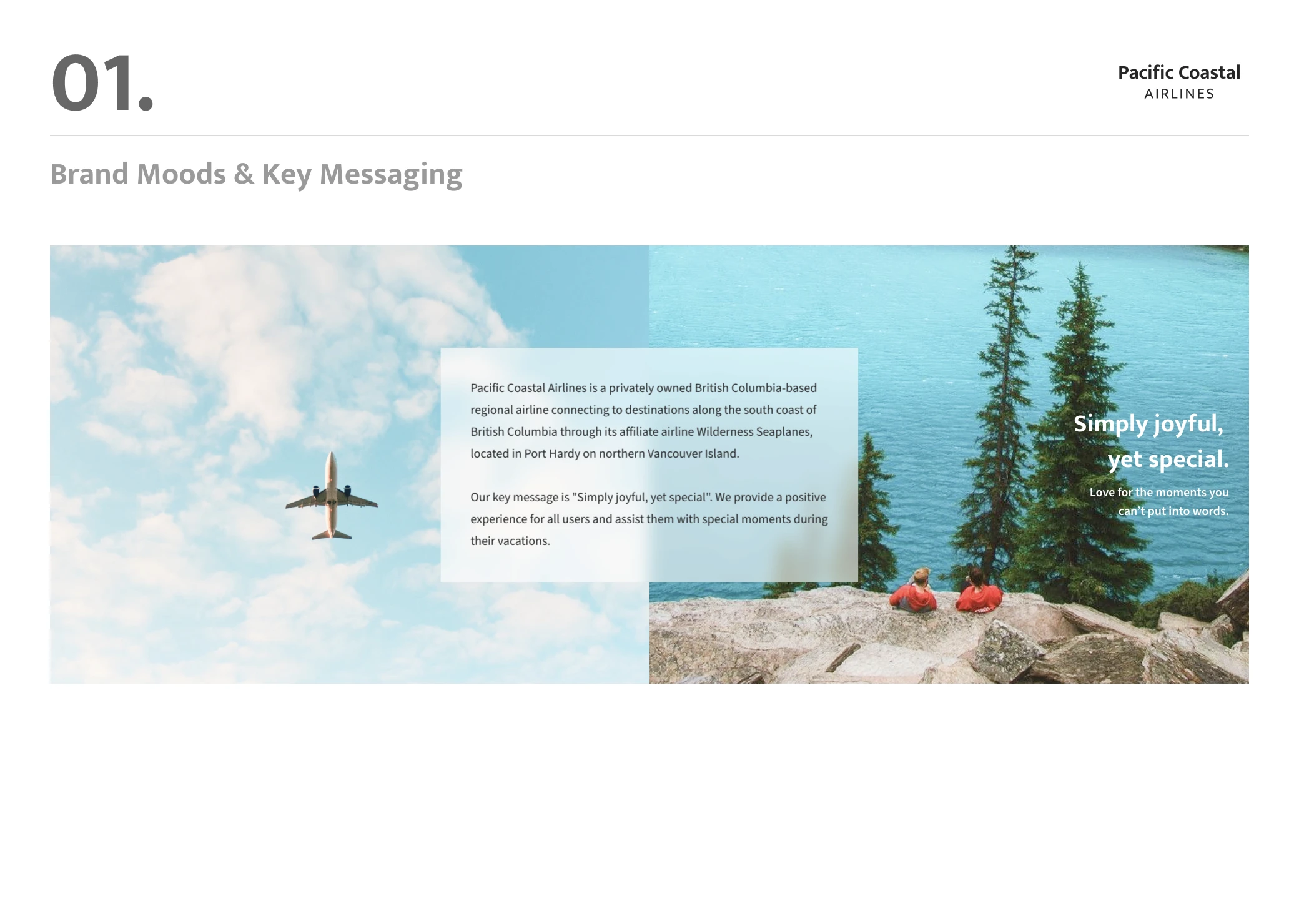
Pacific Coastal Airlines is a privately owned British Columbia-based regional airline connecting to destinations along the south coast of British Columbia.
As a part of the UI Design course with CareerFoundry, I redesigned their responsive web app by creating a new set of user interfaces to build a new visual identity that brings a more fresh and modern atmosphere.

Personas
In order to have a clear understanding of users' visions, I created 2 personas. As always, during the design process, having personas helped me make decisions to align users' goals.
User flow for booking flights
I created a user flow at the beginning of the design process to understand the process users take to complete their main tasks. Although I created flows for the entire site, for this project, I specifically focused on redesigning the usability and visual elements of the booking process.
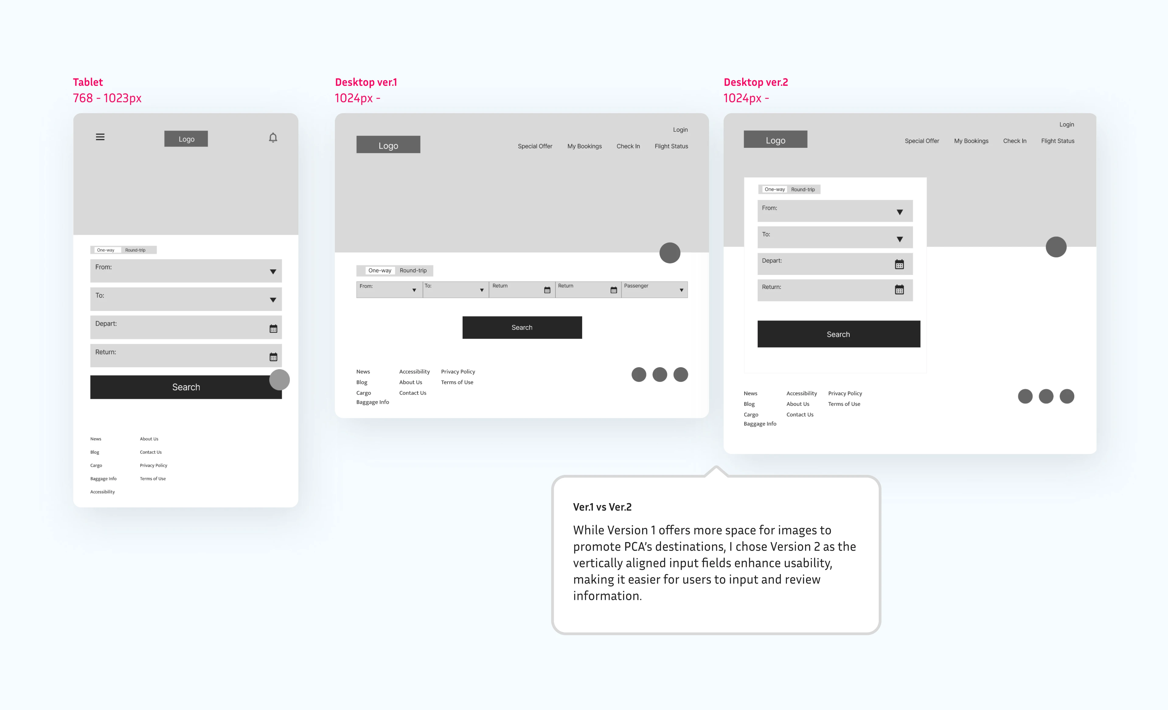
Lo-Fi wireframes for Landing page
Mood boards
After studying user needs and app navigation, I developed two mood boards to establish a clear visual direction. Since the target users are young women planning a special trip to BC, I chose the version B, embracing a theme of "Simply joyful, yet special."
Version A
This leans traditional with nostalgic tones from the original brand palette.
Version B
This evokes fresh and joyful emotions.
Icons
Developed custom icons to enhance the interface with a unique visual texture, using Material symbols as the foundational structure. Version A was selected to evoke a sense of "joy" for target users, with colors and sizing carefully adjusted to ensure optimal legibility.
Version A - duotone

thumb_up
Add a unique touch with the brand colours.
thumb_up
Grab attention.
thumb_down
Hard to read at small sizes.
Version B - broken line

thumb_up
Sleek and minimalist look.
thumb_down
Hard to recognize for complex symbols.
Style guide
Once I had decided on my visual direction, essential visual elements were created.
High-fidelity prototypes
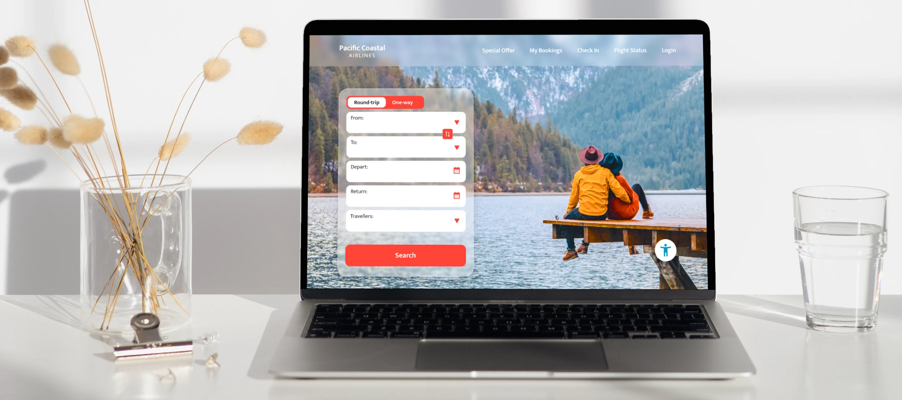
With some design iterations, I created a set of High-Fidelity prototypes from the wireframes.
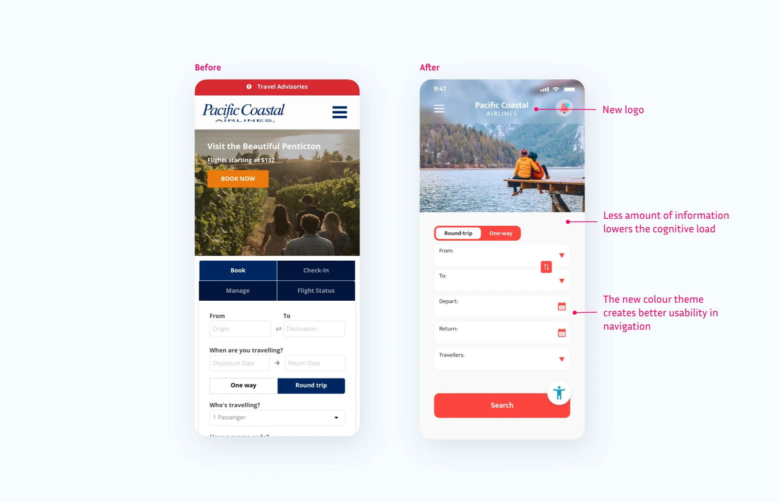
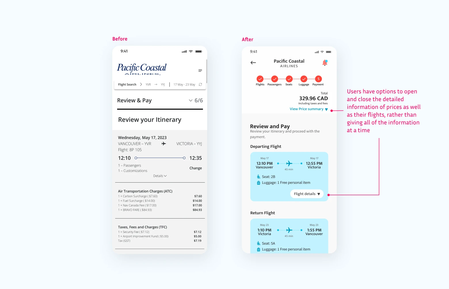
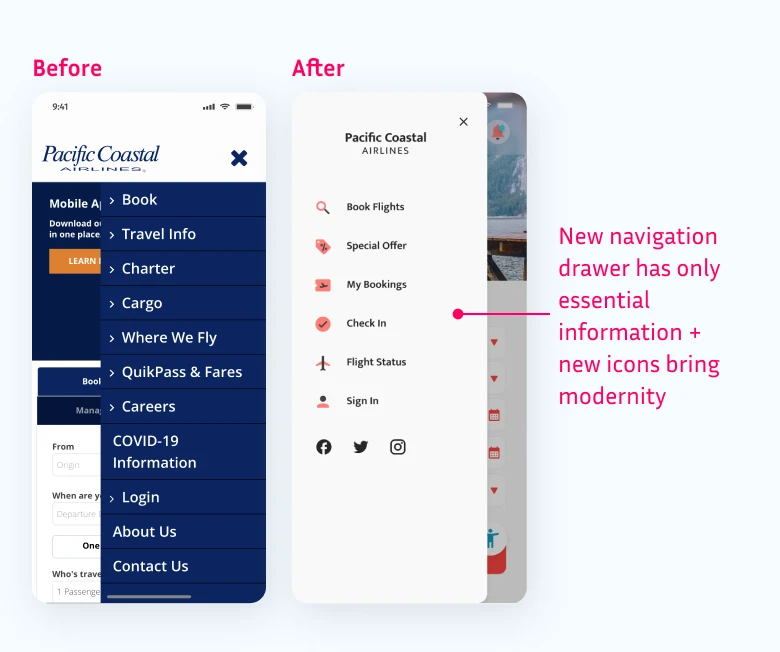
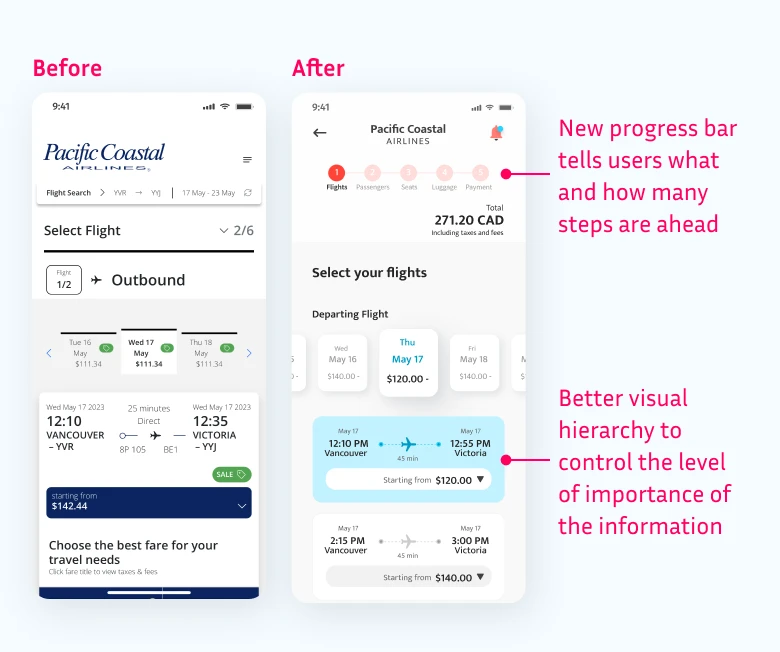
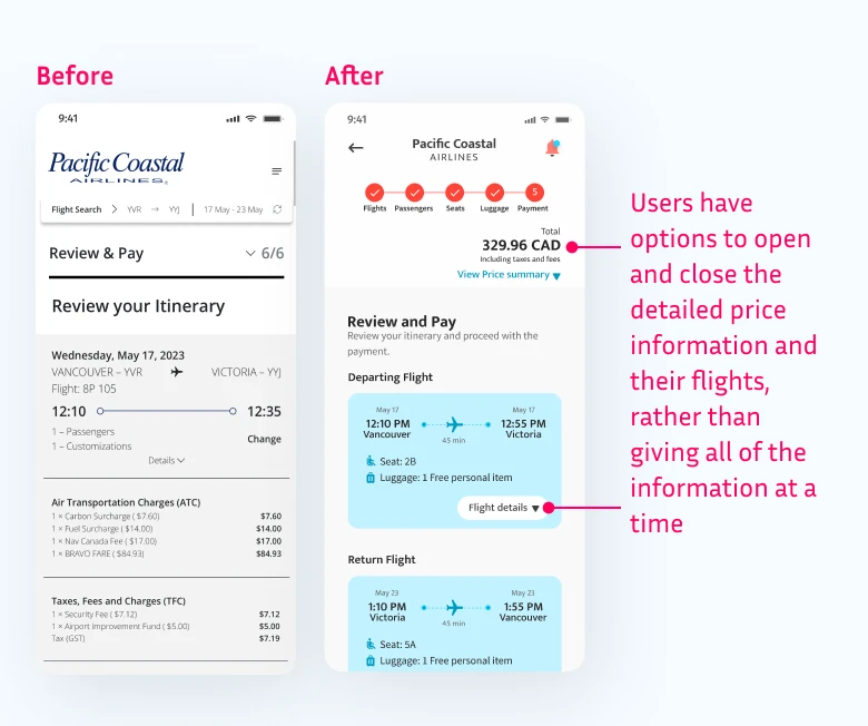
Before and After explained
More testing
I used a colour contrast checker to ensure the readability of the app meets WCAG requirements for people with visual impairments. Especially the button colour and text size are carefully chosen to have enough contrast ratio to pass the minimum WCAG AA requirements.
I also created an accessibility feature that allows users to change screen contrasts, font sizes, etc.
The next step will be to test out the readability of the app with users with visual impairments for further iterations.


