OVERVIEW
Konnect. is an end-to-end design project that I completed as a part of the UX Design course with CareerFoundry. Working from the frameworks of user-centred design and the design thinking process, I developed and tested a responsive app that helps people connect with local community resources.


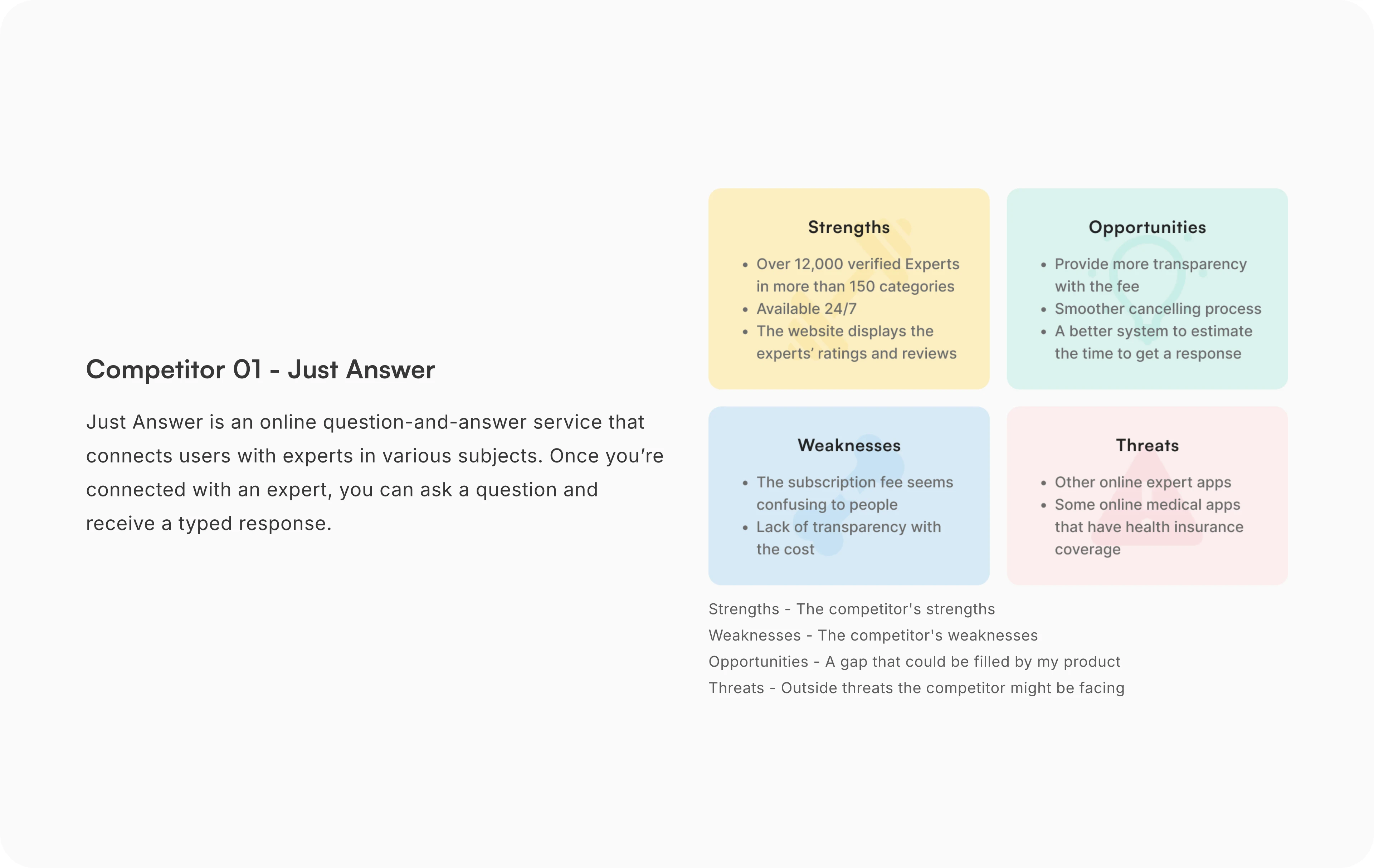
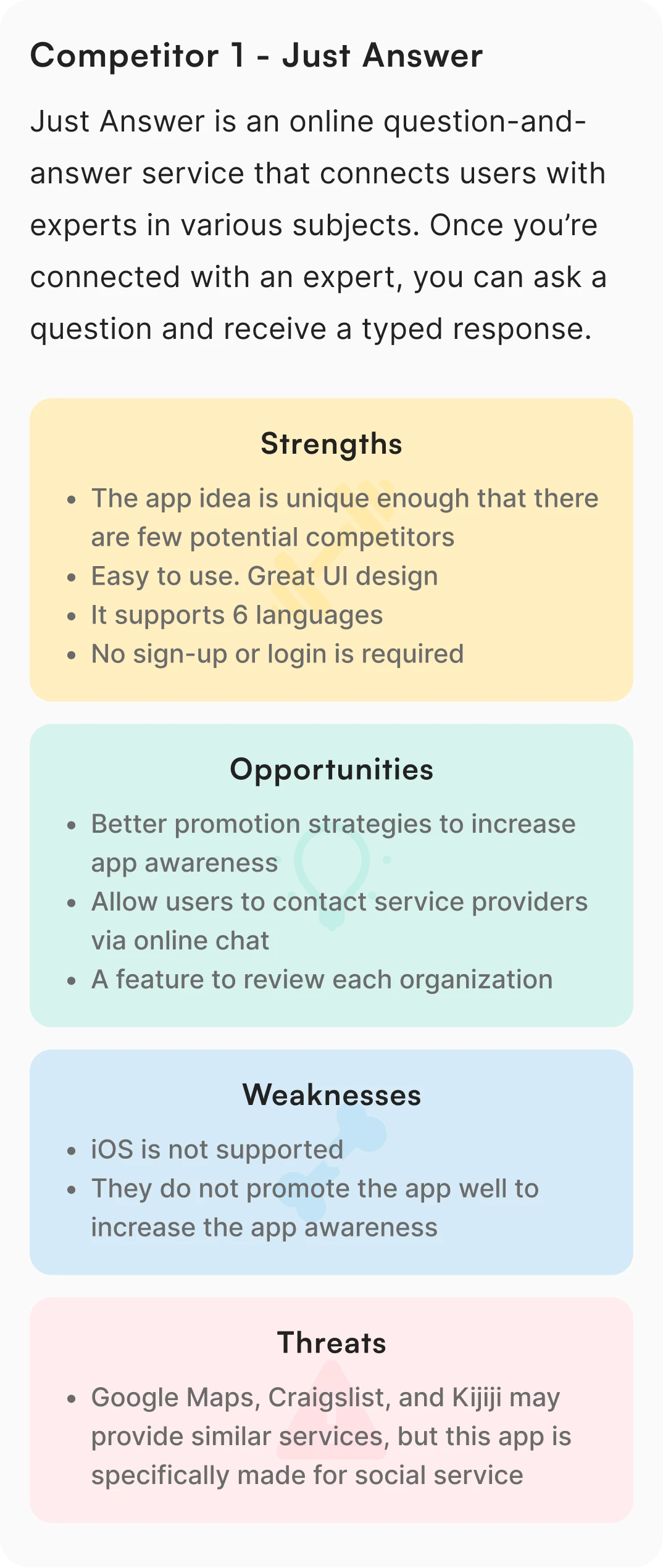
MARKET RESEARCH
Competitive analysis
During market research, I conducted a competitive analysis to get ideas of:
What users might expect from my app
Which of my competitors are doing a good job at solving user problems
Underserved opportunities in the market
Then, to show the research summary, I created SWOT profiles of each competitor.
Competitors I had research on


UNDERSTANDING THE USER
User interviews
User interviews allowed me to understand users’ general attitudes and feelings by asking open-ended questions. After market research, I used this method to learn what kind of community services users use, how they find the information, etc. This allowed me to narrow the scope of the design concept.
Affinity mapping
After the interviews, I needed to analyze the findings. The affinity mapping process revealed relationships between many individual components. This process helped me to understand users’ behaviours/motivations in certain situations and enabled me to see how I could take action to address users’ needs.


Key findings

01.
Users get frustrated when:
They have to make a lot of calls.
They have to wait for a long time to get service.
They do not know how long the wait time is or when the appointment is.
As a solution, a display of wait time would be helpful.

02.
Users want multiple options for communication tools:
Video calls are more popular than chat.
Users need a way to send pictures and documents.
Users want a way to make an appointment for in-person or video call sessions.

03.
Reputations are important:
Users check reviews and reputations of the service provider before making contact.
Friends are also a popular resource to find information.

04.
As always, the app needs to be intuitive:
Users also want some visual cues/support to understand the information.


INFORMATION ARCHITECTURE
Card sorting
To ensure the site’s information architecture aligned with user expectations, I conducted a closed card sorting exercise using OPTIMAL WORKSHOP, testing 12 cards across 4 categories with 8 participants. As expected in a closed sort, feedback was straightforward, leading to a minor sitemap adjustment.


Sitemap
After several design iterations, I identified redundancies in content and unnecessary pages, which revealed where content could be consolidated or deleted.
With a better understanding of how users group information and what pages are most necessary, I created a sitemap to outline the organization of content and navigation structure.

Wireframes

TESTING
Usability testing
In order to assess the learnability of new users interacting with the app for the first time, I conducted moderated usability testing with 6 participants (in-person and online) who fit my criteria using my clickable Mid-Fi prototype. In the test, the participants were asked to do 3 scenario-based tasks and answer corresponding questions to measure if users understand the app and how to complete basic initial functions. Each of the sessions took 15 - 20 minutes to complete. Click here to see the test scripts.
The features and functionality tested are:
Task 1 - Finding an expert and saving the expert to the user's favourites
Task 2 - Making an appointment with the expert
Task 3 - Checking the user's upcoming appointment
To analyze test findings, I used an affinity map to categorize components, followed by a rainbow spreadsheet to visualize patterns. This process helped identify user errors and possible solutions
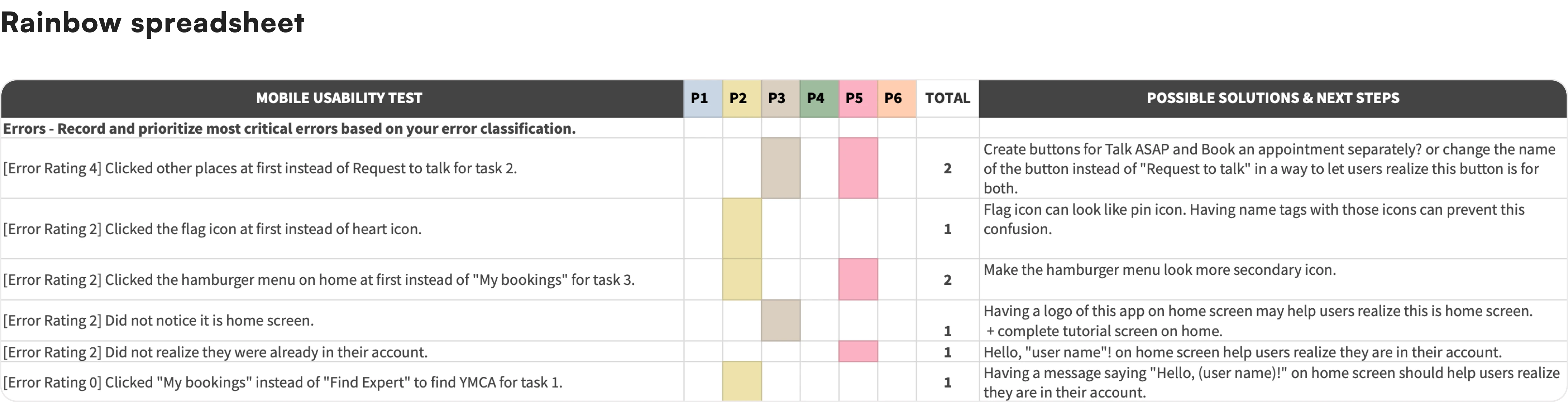
Key Findings

01.
Issue 01.
When making an appointment with an expert, 33% of participants clicked other places first, instead of the “Request to Talk” button (Task 2).
Solution
arrow_right_alt
Create buttons for "Talk Now" and "Book for Later" separately.
Since Participants 3 and 4 thought the "Request to Talk" button was for instant chatting and P4 expected to have a "Request Appointment" button separately. This solution should give clearer navigation for new users.
02.
Issue 02.
50% of participants commented that they wanted to know if there may be a charge before starting the app and wanted to see the cost of each expert's time before requesting to talk.
Solution
arrow_right_alt
On each expert profile page, display the cost of the expert's time.
P6 commented that “Many people who need community resources are in poverty, so if there is a charge, that has to be noticeable”. These clear displays about charges should solve the issue.
03.
Issue 03.
When saving an expert to their favourites on the expert's profile page, some participants clicked the Flag icon at first instead of the Heart icon (Task 1).
Solution
arrow_right_alt
Add labels to each icon.
As the Flag icon can look like a Pin icon, some participants thought the Flag icon was to save as a favourite. P1 commented that they did not know what the other icons mean next to the Heart icon (Share icon and Report icon). Having name tags on the icons should reduce this confusion.
04.
Issue 04.
When looking at the Home screen, some participants did not instantly realize it was the Home screen or they were already in their account.
Solution
arrow_right_alt
Add the app logo and a welcome message saying "Hello, user name"! on top of the Home screen.
These visual cues should give a sense of being on the Home screen of their personal account to new users.


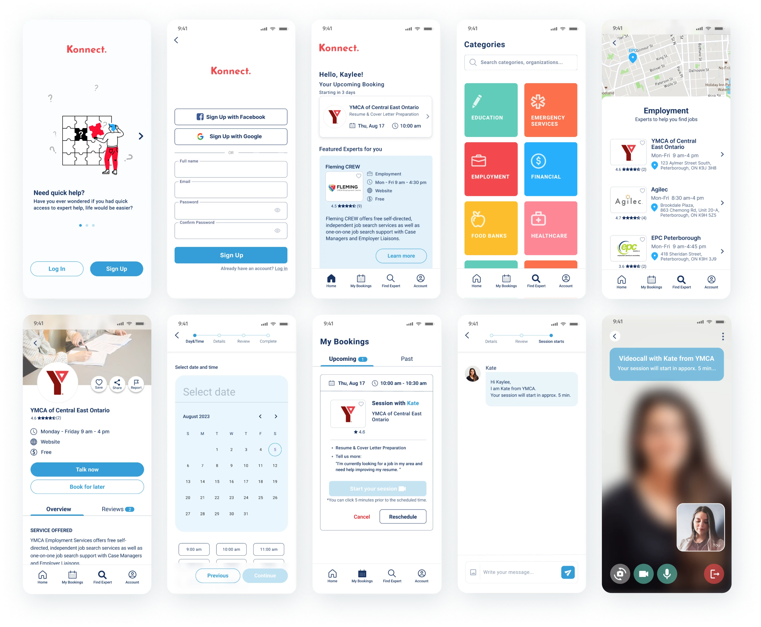
FINAL DESIGN
UI design
After resolving usability issues, I conducted A/B testing and peer reviews to enhance the UI, aiming for a design that is intuitive and enjoyable. Additionally, using a colour contrast checker, I ensured accessibility for users with colour blindness and visual impairments, especially focusing on button colours to meet WCAG AA standards.